Nobody Caught This Font Choice? Really?
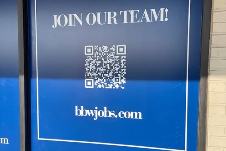
At first glance, this sign looks like a standard “join our team” recruitment poster—clean design, bold letters, and a QR code. But look a little closer at that URL: “bbwjobs.com.” It’s supposed to advertise career opportunities at Bath & Body Works, but thanks to an unfortunate font and lack of spacing, the message unintentionally veers into… very different territory.
It’s a classic case of graphic design gone wrong. With just a little more attention to spacing or a clearer font, this awkward mix-up could’ve been easily avoided. Instead, passersby are left doing a double take, unsure whether they’re being invited to work in retail or redirected to a very different kind of website. It’s a funny but important reminder: always, always check how your text looks in the wild.